How do you communicate an idea without explicitly stating it? That’s the challenge, and the beauty, of data visualization. Below are two of my first projects in this field. While colorful and playful on the surface, they were among the most technically challenging pieces I’ve created so far.

data visualization

2024

pizza or tacos?

The posters you see use smiling faces and bold graphics to visually persuade the viewer to choose between pizza or tacos, based on which food is shown to spark greater happiness.

The visual style I aimed to capture was inspired by the bold posters and vibrant graffiti that cover the walls and streets of New York City.

These designs were created with placement in mind, intended to be displayed near pizza or taco restaurants, subtly influencing the viewer and persuading them to choose one over the other.

before there was Spotify, there was Sinatra!

Frank Sinatra became a legend in the music industry through his iconic voice and emotional connection with audiences, long before platforms like Spotify. He built a massive following through radio, records, and live performances, earning worldwide admiration. His timeless hits and cultural influence established him as an enduring icon in entertainment.

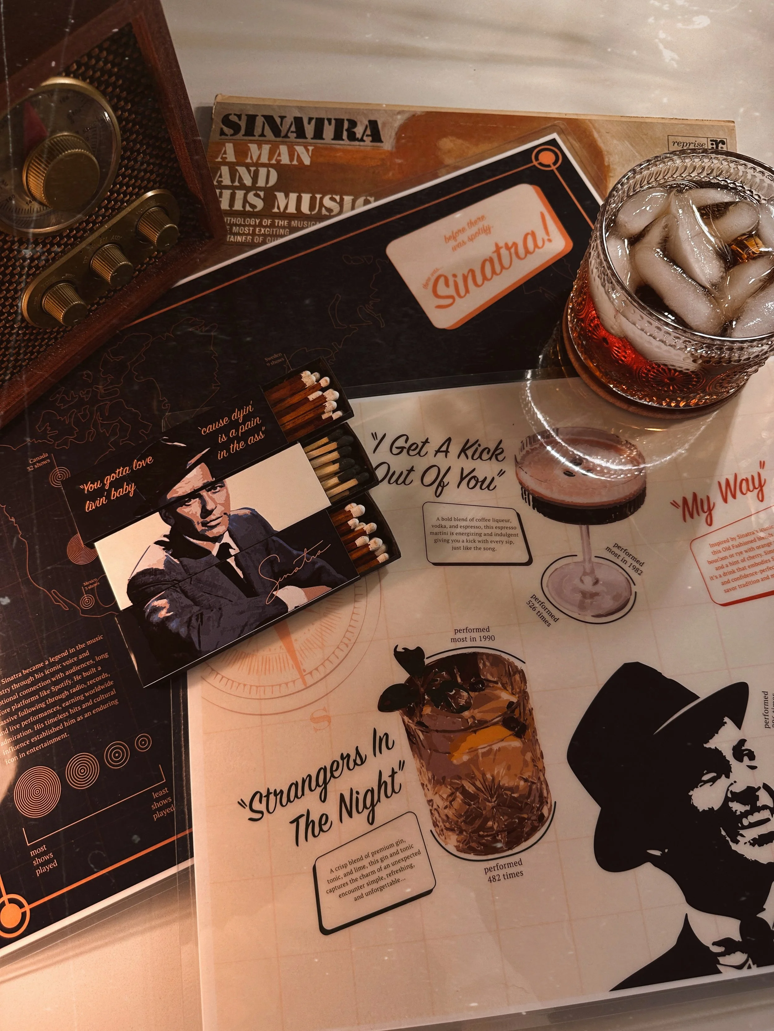
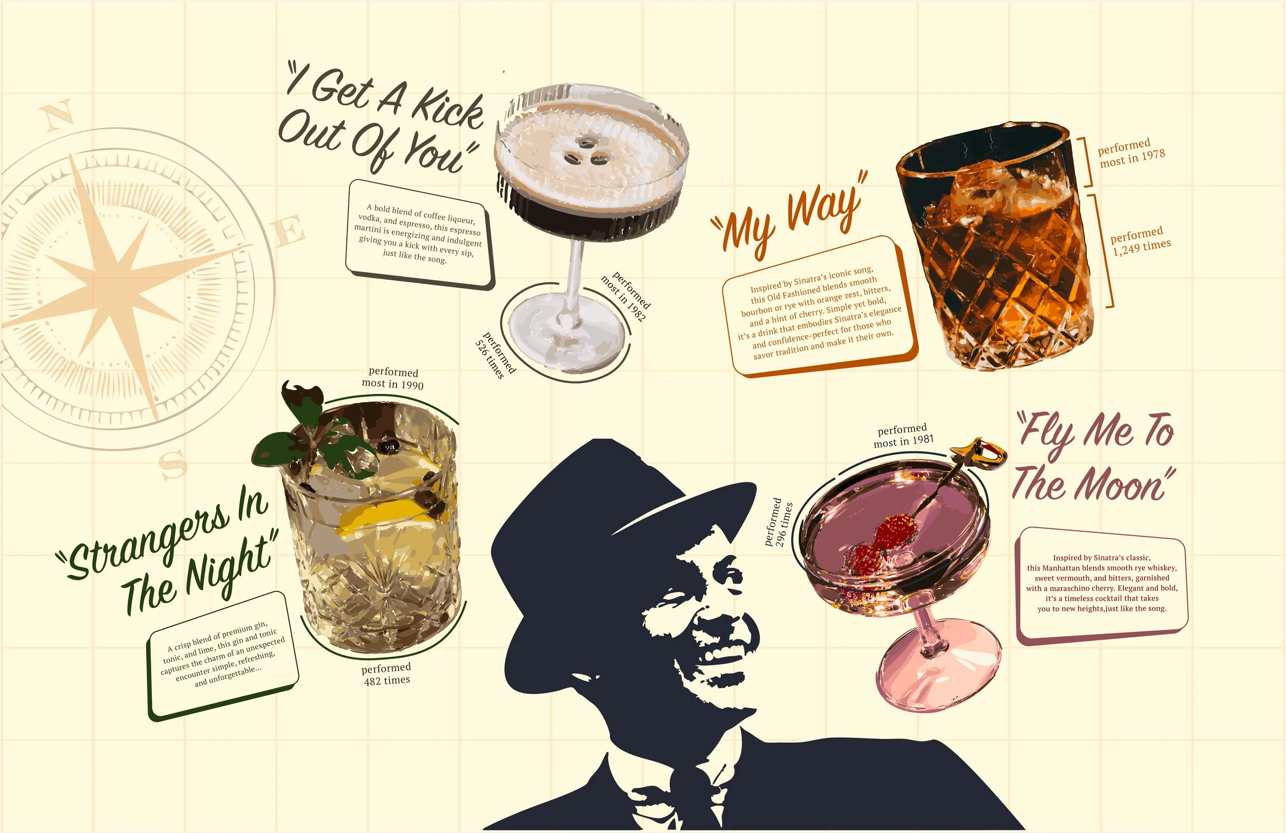
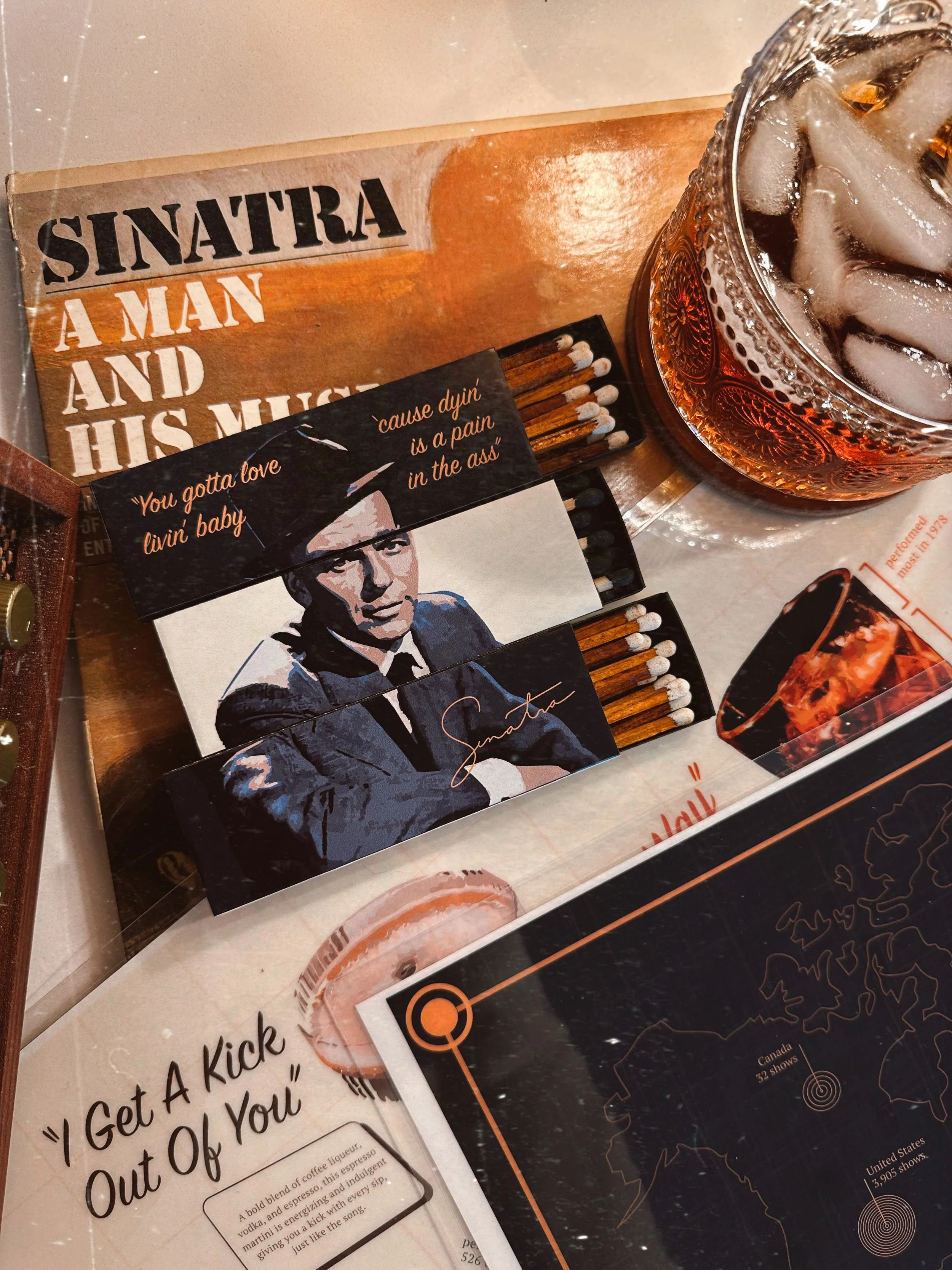
This vintage, bar-inspired cocktail menu tells the story of Sinatra’s career through data. Each “drink” reveals a different chapter. One side of the menu is a map showing how many times he performed in each country. The other side showing which songs rose to the top, and the years they were most beloved, using different cocktails named after those songs.

Visually, it draws from the atmosphere of a dimly lit dive bar with a glowing jukebox, the kind of place where Sinatra’s voice hums softly in the background.